
Upright is a company committed to reshaping how we approach health and wellness in the workplace. Their mission is simple yet ambitious: to help organizations reduce the risks associated with sedentary lifestyles and promote better physical and mental health among employees. Through a holistic focus on quality sleep, nutrition, and physical activity, Upright positions itself as a key player in the corporate wellness landscape.
As a freelance designer, I was brought in to create the brand identity from the ground up—from the logo and visual language to the full website experience. The goal was to craft a brand that felt both professional and optimistic, grounded in science but accessible to all.
Client

The challenge was twofold:
First, positioning Upright as a credible and trustworthy expert in corporate health, a field often saturated with vague or generic messaging. The brand needed to convey authority while remaining approachable and human.
Second, the visual and verbal identity had to resonate with both decision-makers in companies (HR, management) and individual employees. It was essential to find the right balance between B2B clarity and B2C warmth.
On the digital side, the absence of a website and a clear visual system meant that Upright was invisible online—limiting its reach, impact, and business opportunities.

I developed a full branding system and digital presence to clearly express Upright’s purpose and personality:
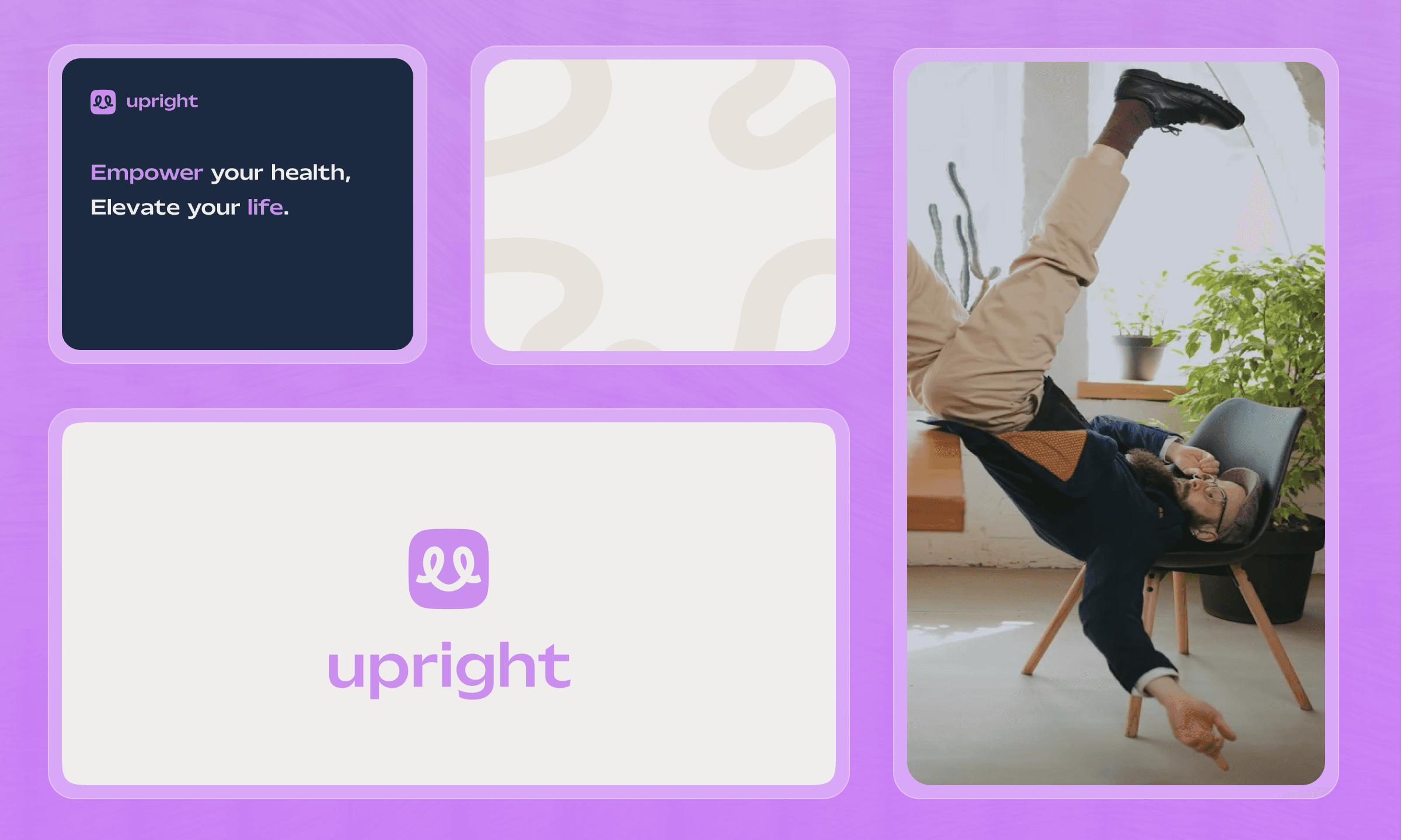
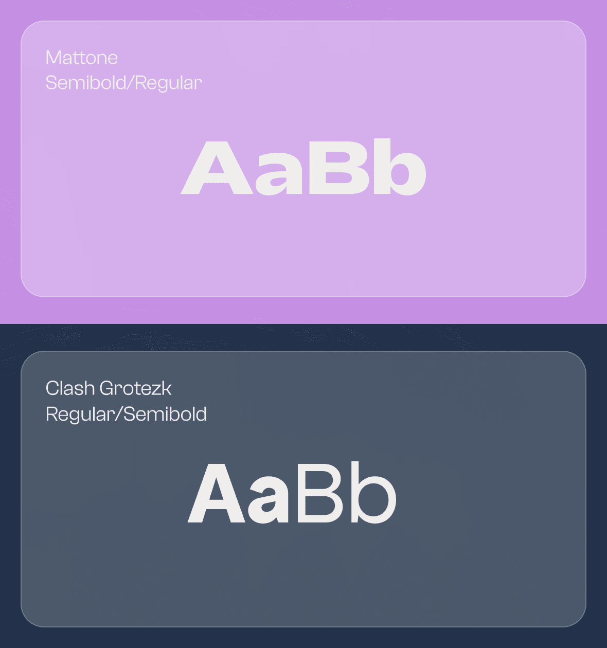
Visual Identity: I designed a clean, modern, and energizing logo that evokes posture, structure, and balance. The visual system is built around a fresh color palette, expressive yet professional typography, and a set of custom illustrations and icons to bring abstract concepts like sleep or stress into a friendly visual form.
Brand Voice: The tone of voice was crafted to be positive, educational, and actionable—positioning Upright as a supportive expert rather than a distant authority.
Website Design: The site was designed to be fluid, informative, and conversion-oriented, with a structure that showcases the brand’s three pillars (sleep, nutrition, activity) while guiding users toward getting in touch or exploring Upright’s services.
Scalable Design System: To ensure brand consistency across touchpoints, I built a modular system that allows for future content (articles, workshops, programs) to be easily integrated without sacrificing clarity or coherence.


The result is a cohesive, modern, and meaningful brand that positions Upright as a trusted ally in the corporate wellness space. From the first scroll on the website to the smallest icon, every detail was designed to reinforce Upright’s core promise: helping people live healthier lives without compromising their professional goals.
This project reflects the power of strategic design and thoughtful branding—not only in creating visual appeal, but in building credibility and emotional connection in a crowded market.