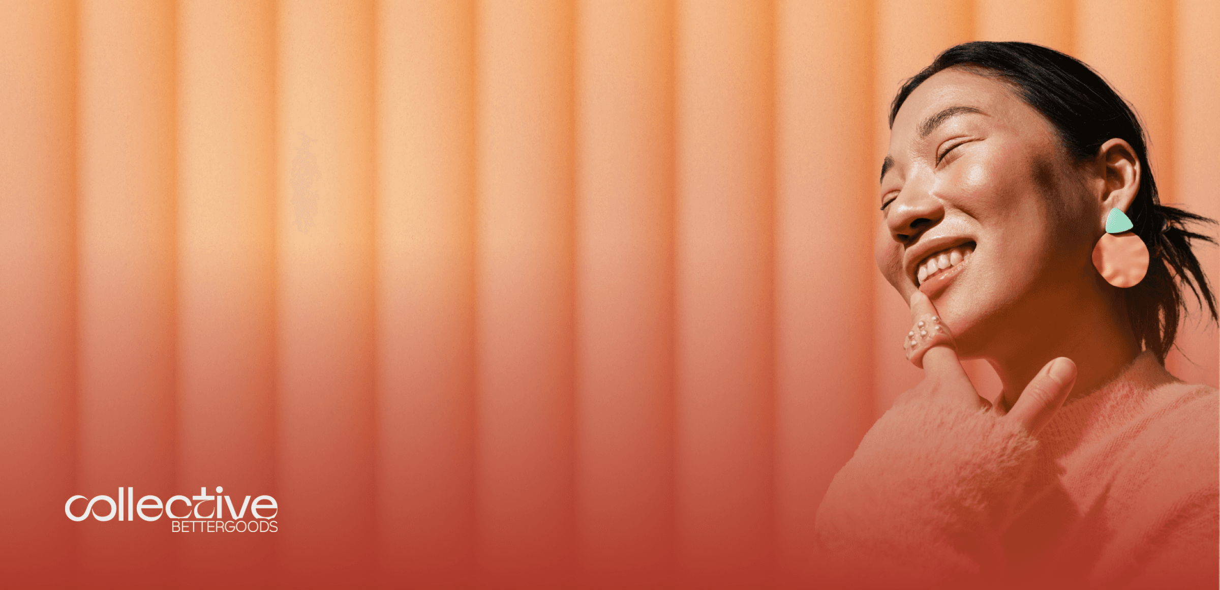
Collective Better Goods is a job board with a clear mission: connecting professionals with companies that prioritize sustainability, ethical business practices, and social responsibility. As part of this project, I was responsible for enhancing the user interface (UI), user experience (UX), and the overall branding to create a more seamless, engaging, and visually compelling platform. The goal was not just to improve aesthetics but to align the platform’s design with its values, ensuring an experience that feels both intuitive and purpose-driven for job seekers and recruiters alike.
Client

Despite its strong mission, the platform faced several usability challenges that hindered engagement and conversions. The navigation lacked clarity, making it difficult for users to browse and apply for jobs efficiently. The search and filtering system needed improvements to help job seekers find relevant opportunities without frustration. Additionally, the branding—while already established—did not fully communicate the platform’s vision and unique identity, making it harder to stand out in a competitive market.
Beyond these structural issues, the overall user journey needed refinement. The job application process required too many steps, leading to drop-offs. Recruiters also needed a clearer and more appealing way to present job postings, ensuring that the right talent would engage with the listings. The challenge was therefore twofold: enhancing usability while reinforcing the platform’s brand identity.


To address these issues, I worked on a comprehensive redesign and optimization strategy that focused on both functional improvements and visual enhancements:
UI Overhaul: I reworked the platform’s visual hierarchy, typography, and spacing to create a cleaner, more structured layout. By refining the color palette and design system, I ensured that the platform’s identity was consistent, professional, and aligned with its sustainability-driven values.
UX Optimization: The job search and application process was streamlined to reduce friction. I introduced clearer navigation patterns, enhanced filtering options, and progressive disclosure techniques to keep users focused without overwhelming them.
Branding Refinement: Rather than a complete rebranding, my approach was to elevate the existing identity, reinforcing its unique attributes while ensuring better usability. I refined the tone of the platform’s visuals, typography, and micro-interactions to create a sense of warmth, trust, and credibility.
Mobile-First Approach: Given that a significant portion of users access job boards via mobile devices, I prioritized responsive design, ensuring that interactions remained smooth and intuitive across all screen sizes.


The result is a more intuitive, aesthetically refined, and highly functional job board that successfully bridges the gap between usability and brand identity. By refining both the UX and visual storytelling, the platform now offers a more engaging and effective job search experience, helping job seekers find meaningful opportunities with greater ease. Recruiters also benefit from a stronger showcase of their listings, ensuring that their job posts attract the right candidates.
This project was a perfect balance between strategy, usability, and design evolution, demonstrating how thoughtful UI/UX improvements can elevate a platform’s impact and enhance its core mission.